20 Bedroom Color Combinations That Always Look Expensive
Choosing one bedroom color is hard. Choosing two that actually love each other is where most people get stuck — and where most bedroom makeovers quietly go wrong. The good news: the pairings that work have been proven in thousands of beloved bedrooms, and they all follow a simple logic.
Every great bedroom combination has a calm base (usually a warm neutral), a main color with a clear personality, and — in the best ones — a small deep or metallic accent that gives the pair its spine. The twenty combinations in this guide are the greatest hits: timeless, sleep-friendly, and adaptable to any light, size, or budget.
For each one you will find the mood it creates, how to divide the colors around the room, and the one thing to watch out for. Pick the pairing that makes your shoulders drop. That is your room.
In this guide
- The Timeless Classics
- The Romantic & Soft Pairings
- The Warm & Earthy Pairings
- More Combinations to Try
- Three More Pairings Worth Knowing
- Matching a Combination to Your Room’s Light
- The Two-Week Test: Living With a Combination Before You Commit
- How to Use Any Combination: The 60-30-10 Rule
- How to Recreate a Pairing Step by Step
- Real-Life Problems, Solved
- Budget Guide: Where to Save, Where to Spend
- Mistakes to Avoid
- Your Color Combination Checklist
- Frequently Asked Questions
The Timeless Classics
These three combinations have been loved for decades because they work in almost any bedroom on earth.
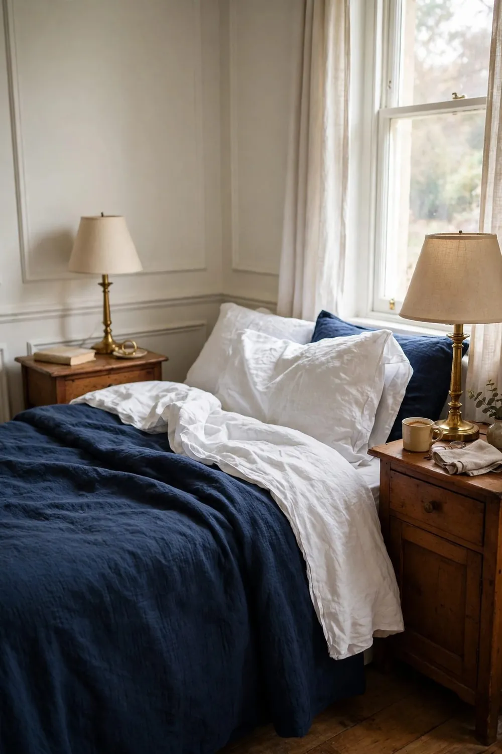
1. Navy & Warm White (With Brass)
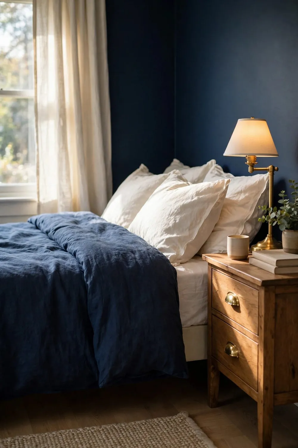
The eternal classic. Navy brings depth and serious calm — it is the color most associated with deep sleep — while warm white keeps the room fresh and light. Use navy on the bedding or one wall, white on walls and sheets, and brass as the jewelry.
Divide it roughly 60% white, 30% navy, 10% brass and wood. Watch out for: cold, bright whites, which make navy feel harsh. Warm white is the whole trick.
2. Sage Green & Cream (With Warm Wood)
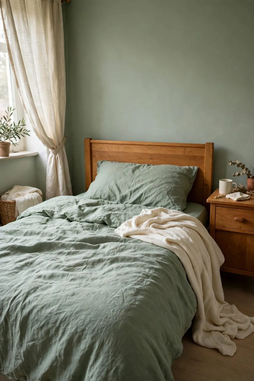
The modern classic, and the most saved bedroom pairing of the last five years. Sage is restful like nature; cream is warm like sunlight. Together they make a room that feels like a garden cottage and a boutique hotel had a baby.
Use sage on bedding or walls, cream on the other, warm wood furniture as the bridge, and one deep forest-green piece as the anchor. Watch out for: cool grey accessories, which chill the whole pairing.
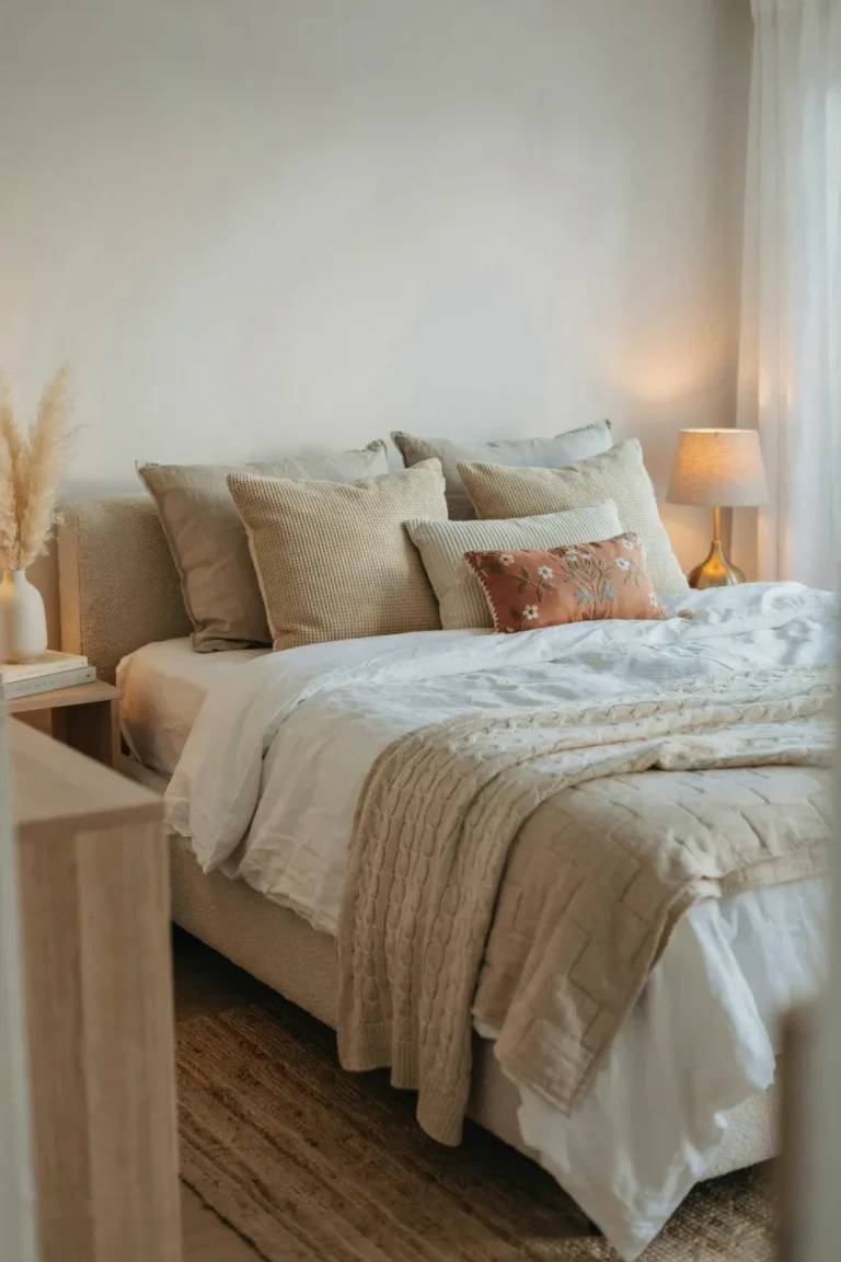
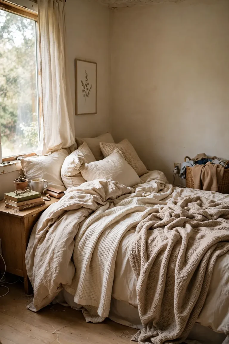
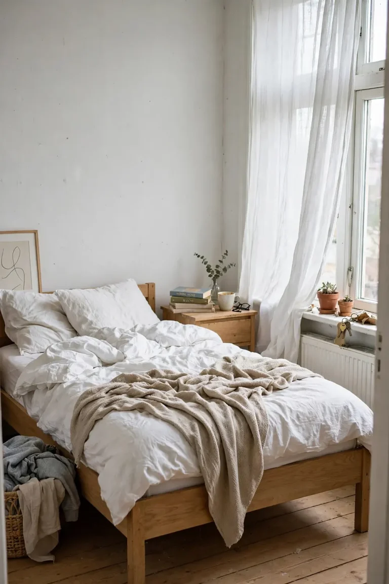
3. Warm White & Natural Wood (Scandi Calm)
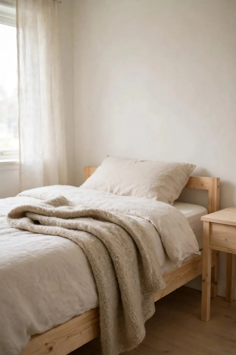
For the bedroom that should feel like a deep breath: warm white walls and bedding, pale-to-mid wood everywhere, and texture doing all the decorative work. This pairing suits small and dark rooms especially well because it reflects every drop of light.
The secret is texture — linen, wool, rattan, woven cotton — because a two-“color” room lives or dies on how it feels to touch. Watch out for: stark blue-white paint, which turns the calm into cold.
The Romantic & Soft Pairings
These combinations trade a little drama for a lot of tenderness — the bedrooms people describe as “dreamy.”
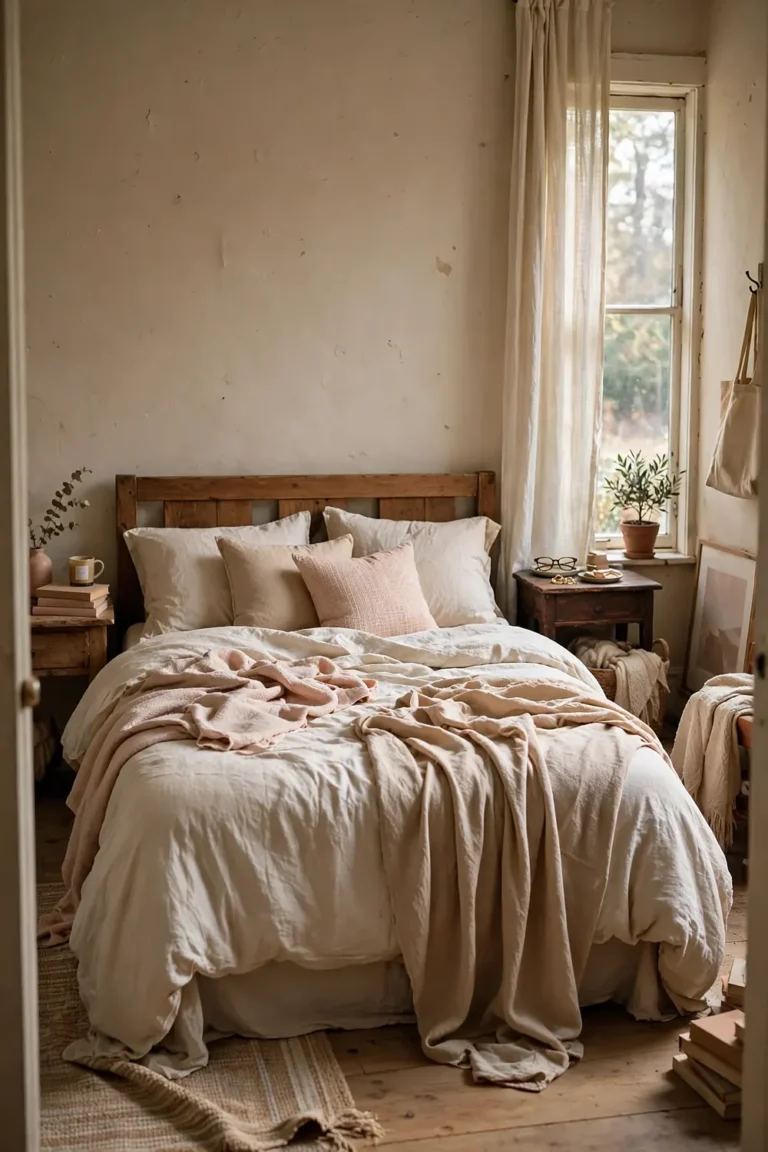
4. Blush Pink & Cream (With Gold)
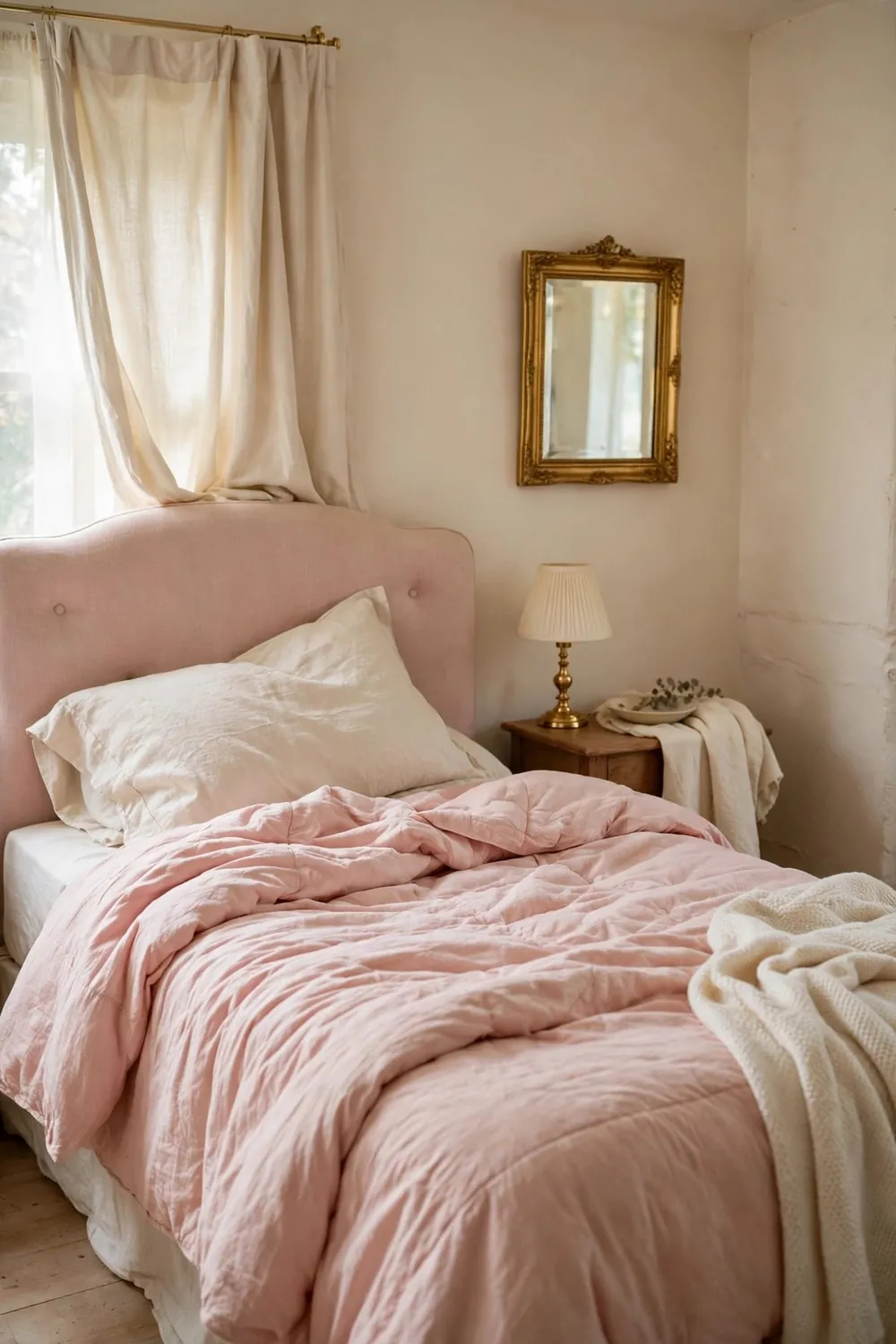
Sunrise in a room. Dusty blush and cream create the gentlest possible atmosphere, and gold accents lift the pair from sweet to sophisticated. Blush on the bedding or one wall, cream everywhere else, gold in the lamp, frames, and handles.
Watch out for: saturated pink (dusty only) and too many romantic accessories. The pairing is the romance; it does not need help from heart-shaped anything.
5. Dusty Blue & Soft White (With Pale Grey)
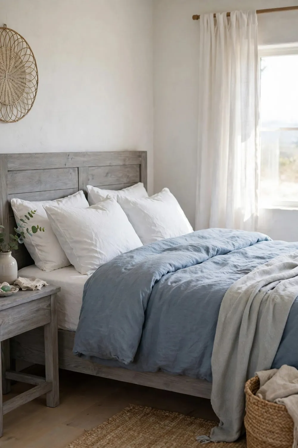
The calm pairing. Dusty sky blue with white and the faintest grey reads like morning by the sea — serene, clean, and famously sleep-friendly. Layer two blues (pale and mid) for depth, keep textiles matte, and add one navy piece as the anchor.
Watch out for: cool light bulbs. Warm evening light is what makes this pair glow dusky instead of icy.
6. Lavender-Grey & White (With Silver or Chrome)
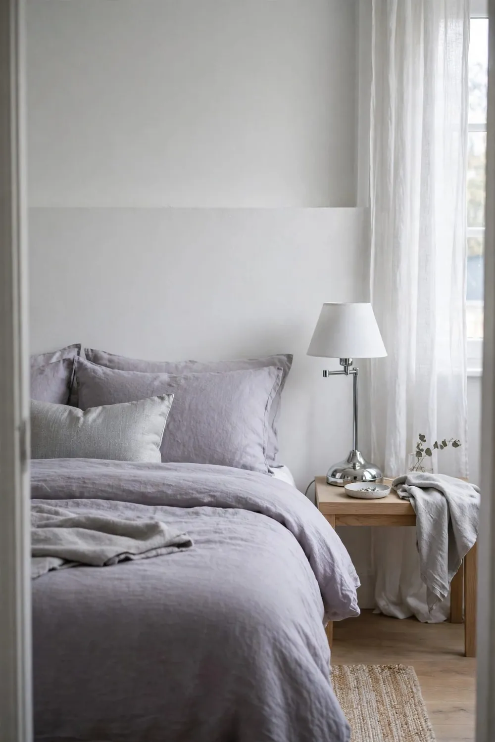
The quiet sophisticate. A grey-leaning lavender — sometimes called greige-lilac — with white bedding and cool metal accents makes a bedroom feel like a calm, expensive hotel suite. It is the most grown-up of the soft pairings.
Use the lavender mostly on walls or a headboard, and keep the bedding white and tailored. Watch out for: too much purple saturation. The grey must always be winning.
The Warm & Earthy Pairings
For bedrooms that should feel like a hug — grounded, warm, and deeply restful in the evening.
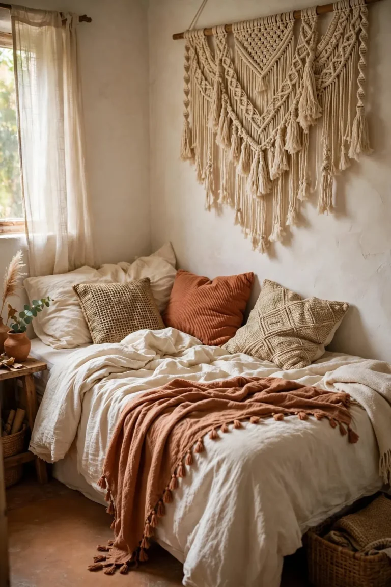
7. Terracotta & Sand (With Cream and Wood)
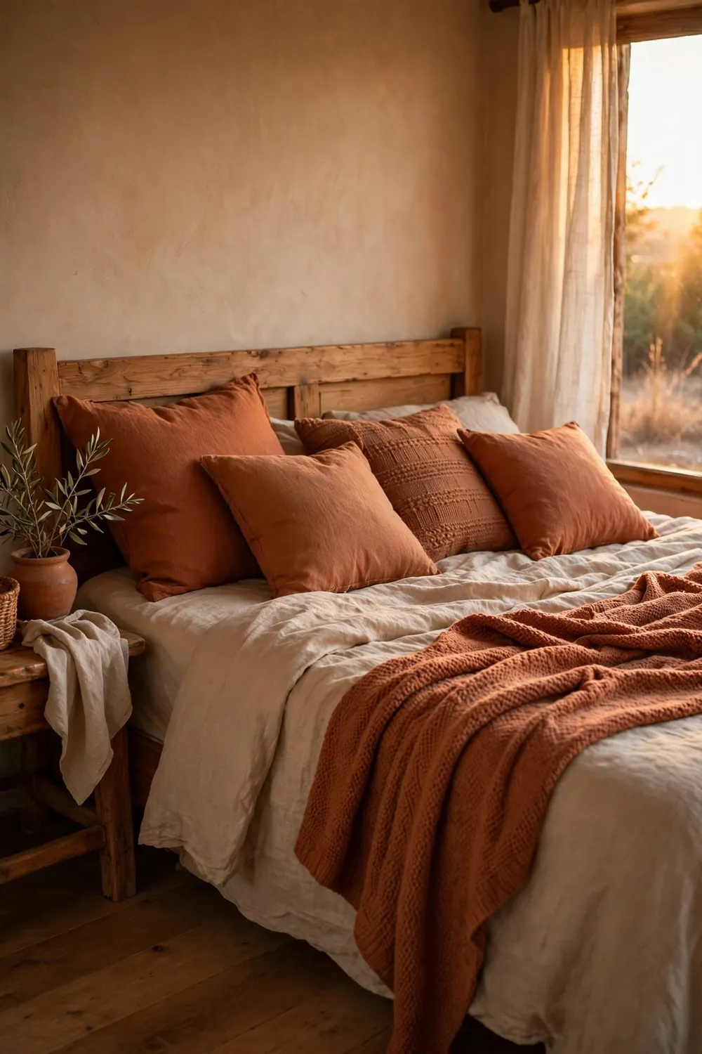
Desert sunset, bottled. Terracotta brings the warmth; sand and cream bring the air. This pairing glows spectacularly under lamplight and suits rooms that feel cold or north-facing, because the colors supply the warmth the light does not.
Use terracotta as the accent first (bedding throw, cushions, one wall if you are brave) over a sand-and-cream base. Watch out for: orange overload — terracotta should visit, not move in.
8. Olive Green & Warm Off-White (With Pale Wood)
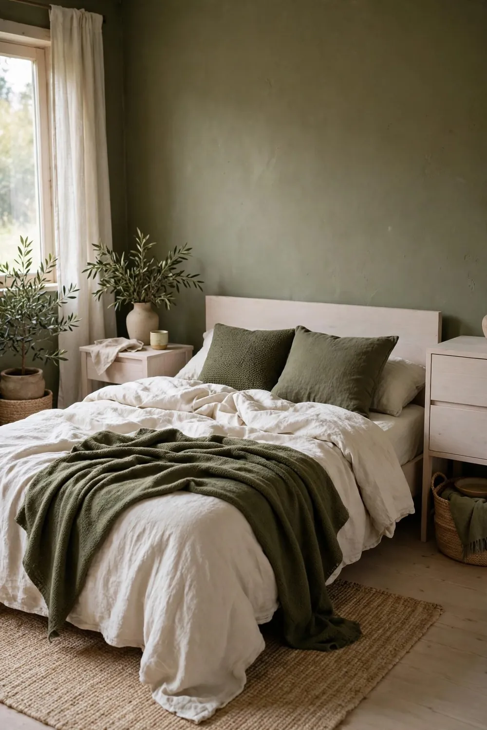
The zen pairing. Deep, muted olive against undyed off-white and pale wood creates the grounded, meditative calm of Japanese-inspired rooms. Best with low furniture, few objects, and lots of breathing space.
Watch out for: brightness. Olive must stay muted and grey-leaning, and the room needs either decent daylight or generous cream to balance its depth.
9. Chocolate Brown & Cream (With Caramel Leather or Wood)
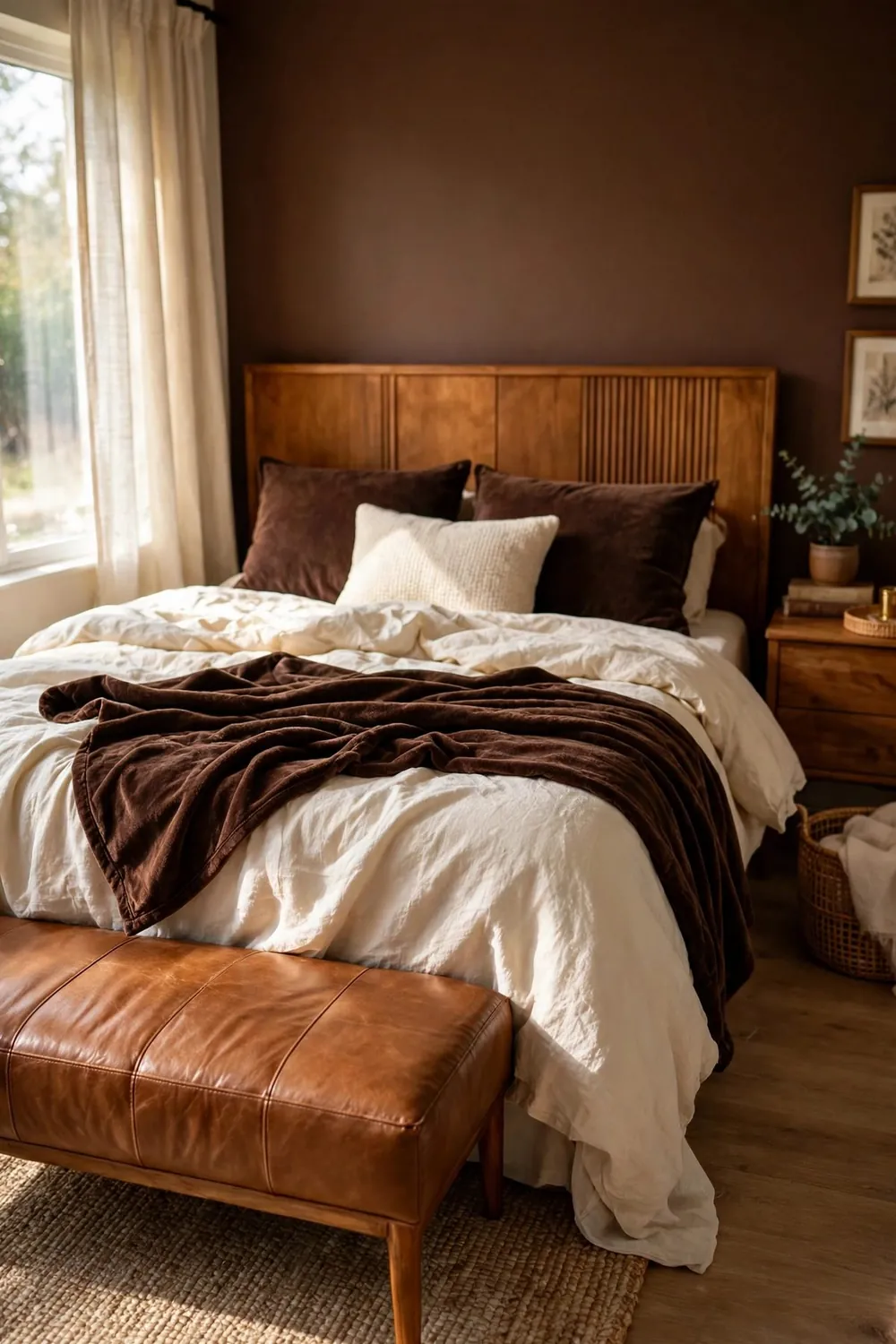
The comeback pairing. Rich chocolate — in a headboard, bedding, or one wall — with cream textiles and caramel-toned wood or leather is deeply cozy and unexpectedly elegant, like a library you can sleep in. It photographs beautifully and feels even better at night.
Watch out for: darkness creep. Cream must hold at least half the room, and warm light matters enormously. Get those right and this is the coziest pairing on the list.
10. Charcoal & Blush (With Warm White)
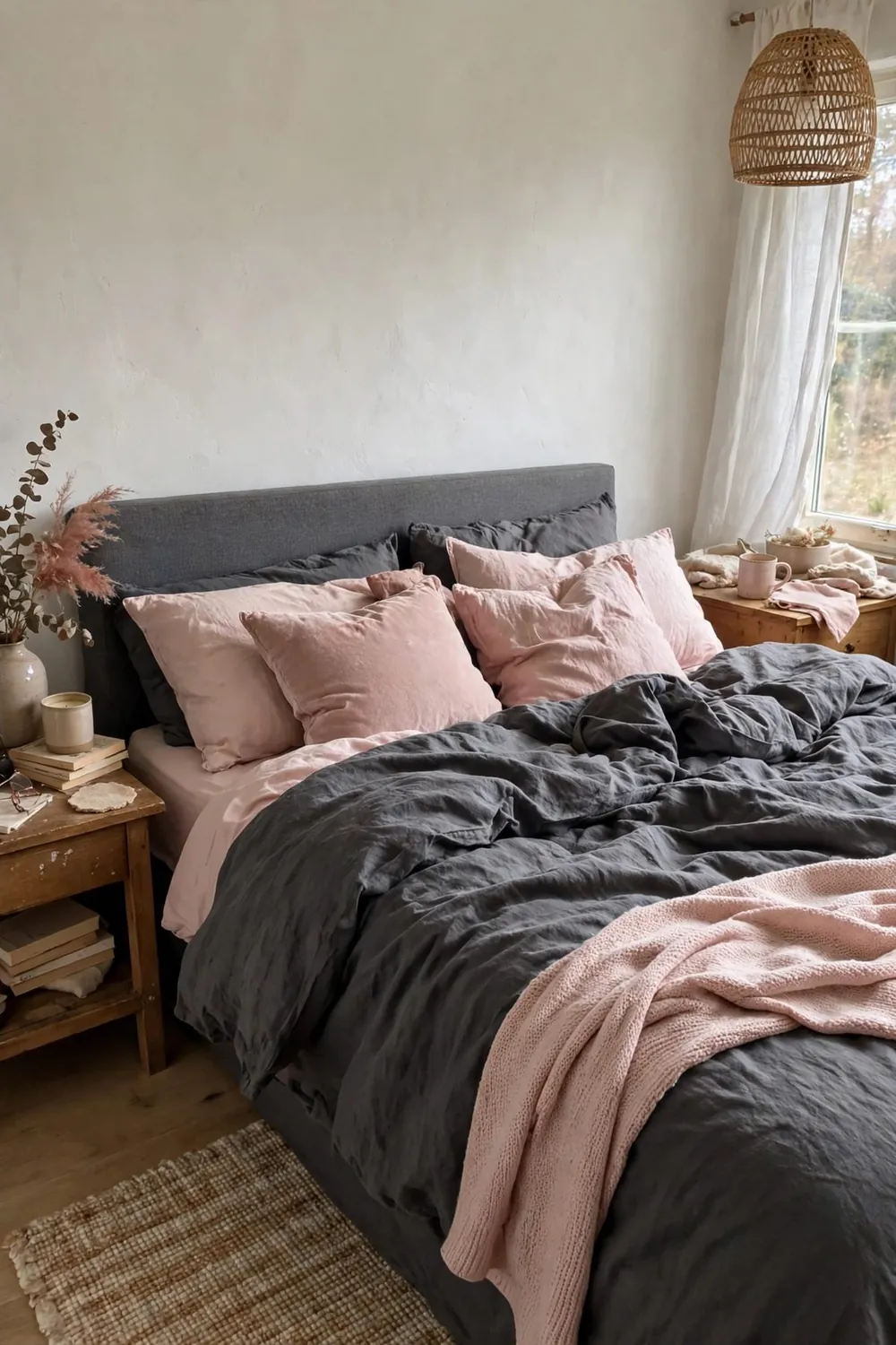
The dramatic romantic. Charcoal walls or bedding give blush pink something strong to lean against, and the contrast makes both colors look richer. Warm white sheets and soft textures keep it sleepable rather than stark.
Use charcoal on one surface only — wall behind the bed or the duvet — and let blush and white do the softening. Watch out for: small, dark rooms, where this pairing can close in. In a bright room, it is unforgettable.
More Combinations to Try
Still collecting ideas? These final additions round out the list — each one tested against the same rule as everything above: it has to earn its place in a real home, on a real budget.
11. Blush Pink & Charcoal: Soft Meets Strong
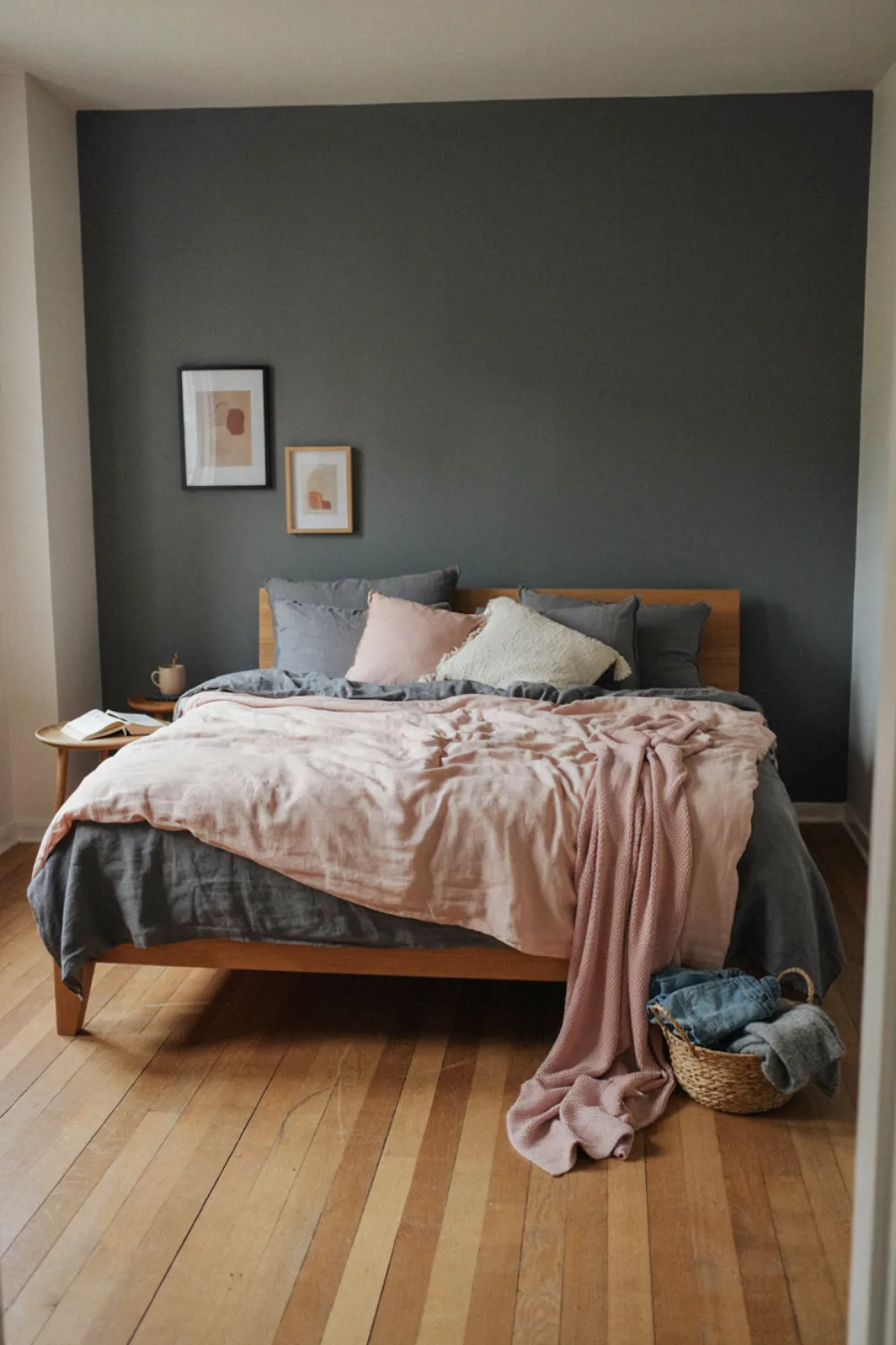
Charcoal gives blush pink its backbone: paint an accent wall or choose charcoal linen, then let blush live in the duvet, cushions, and a throw. The contrast is modern and unmistakably adult, and both colors flatter warm wood and brass.
Ratio tip: charcoal should hold about a third of the room’s visual weight — more, and the pink becomes a garnish; less, and the strength is lost. Test with a charcoal throw over your existing pink bed before painting anything.
12. Terracotta & Cream: Sun-Baked Calm
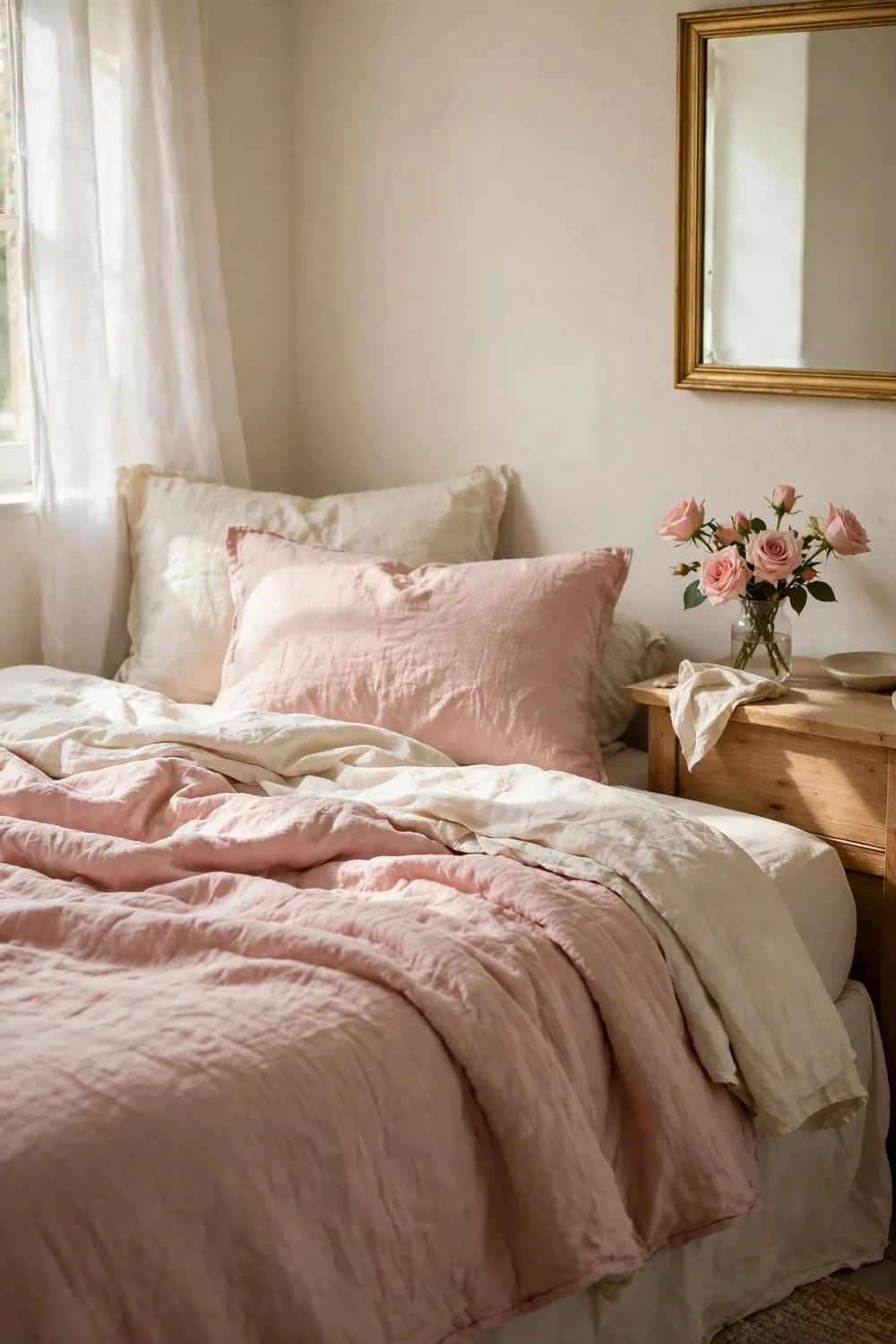
Terracotta bedding or an accent wall against cream everything-else gives a bedroom the warmth of a Mediterranean afternoon. Add natural wood and one green plant and the room feels traveled and grounded at once.
Terracotta varies wildly — choose the dusty, clay version, not the orange one. Paint a large swatch and view it at night; lamplight pushes terracotta warmer, which is exactly when this pairing is at its best.
13. Forest Green & Cognac: Rich and Grounded
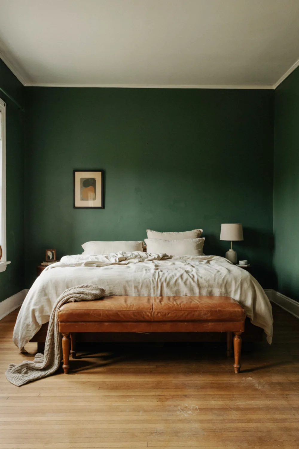
Deep forest green walls or bedding with cognac leather — a bench, a cushion, a headboard — is the library-bedroom pairing: moody, warm, and quietly luxurious. Cream bedding lightens the center so the room stays restful.
This pairing loves low light, so it suits north-facing rooms that fight brighter palettes. Add brass lighting and the room glows like a reading lamp in a wood.
14. Pale Blue & Warm White: Coastal Quiet
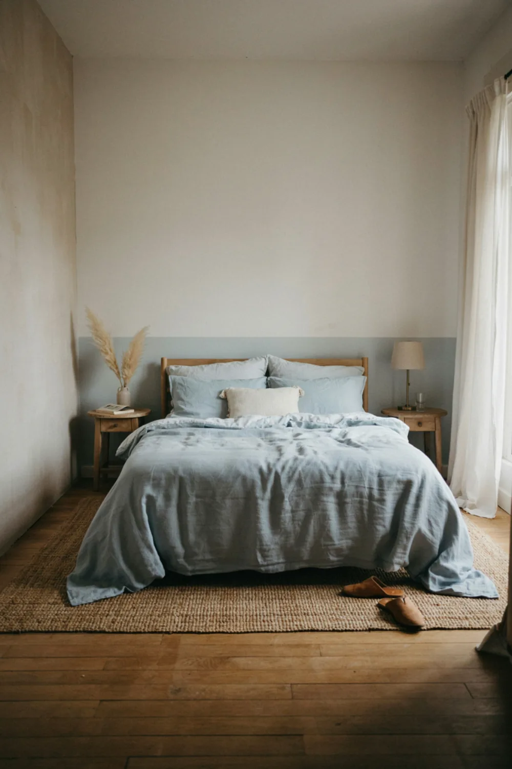
Pale blue and warm white is the calmest pairing in this guide — think morning sea light. Blue in the bedding and one wall, warm white everywhere else, natural textures to stop it feeling cold.
The secret is the white: warm whites carry a drop of cream that keeps blue friendly. Blue-white paint beside pale blue reads icy, and the room loses the restfulness you chose the pairing for.
15. Mustard & Grey: Warmth Without Noise
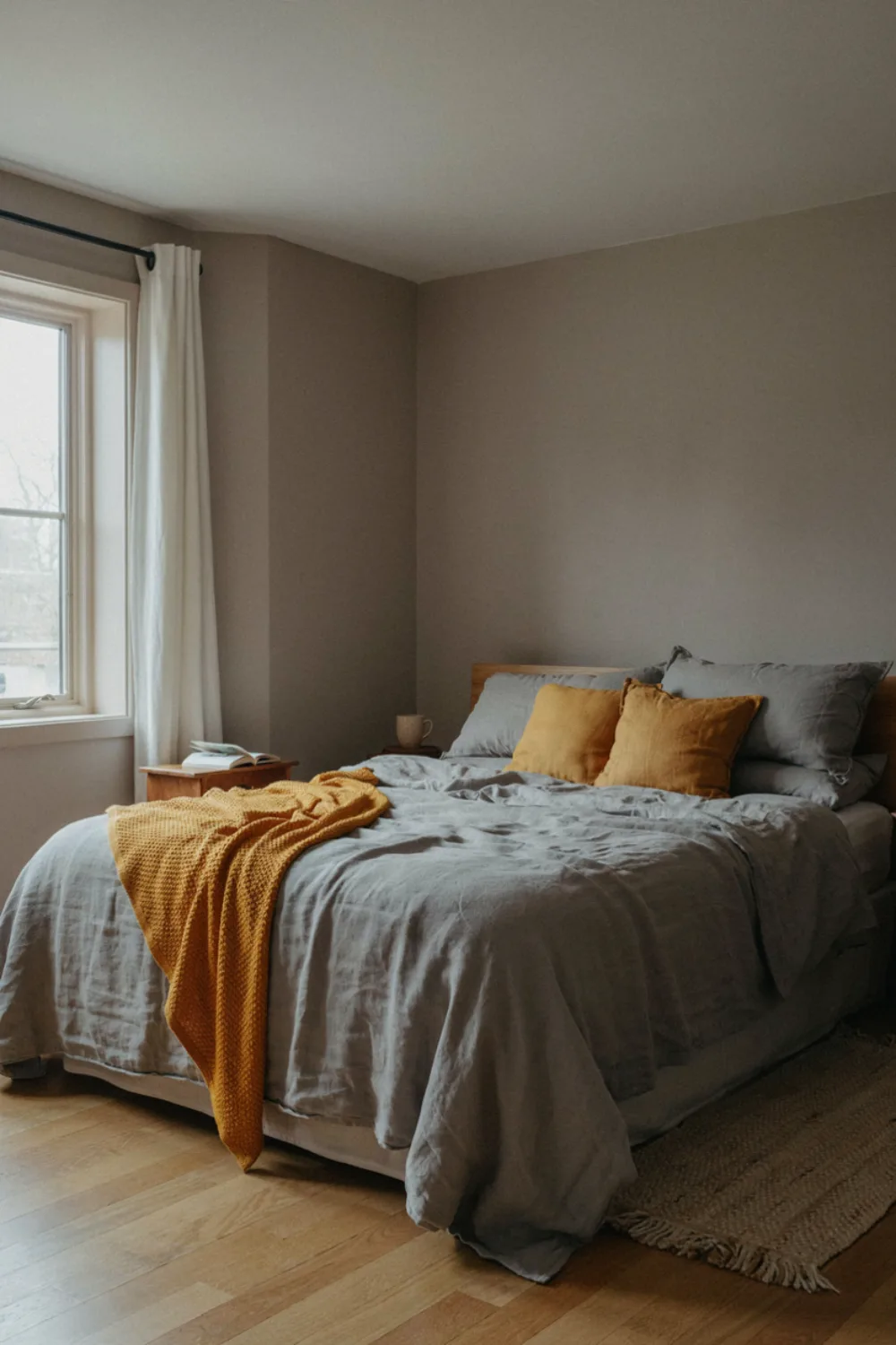
A mustard throw, cushions, or an upholstered chair against soft grey walls and bedding gives a bedroom sunshine that behaves itself. Grey does the calming; mustard does the cheering; neither shouts.
Choose a grey with warm undertones (greige) so the mustard blends rather than clashes. This is the pairing that converts grey-room owners who find their bedrooms restful but dull.
16. Plum & Dusty Rose: Moody Romantic
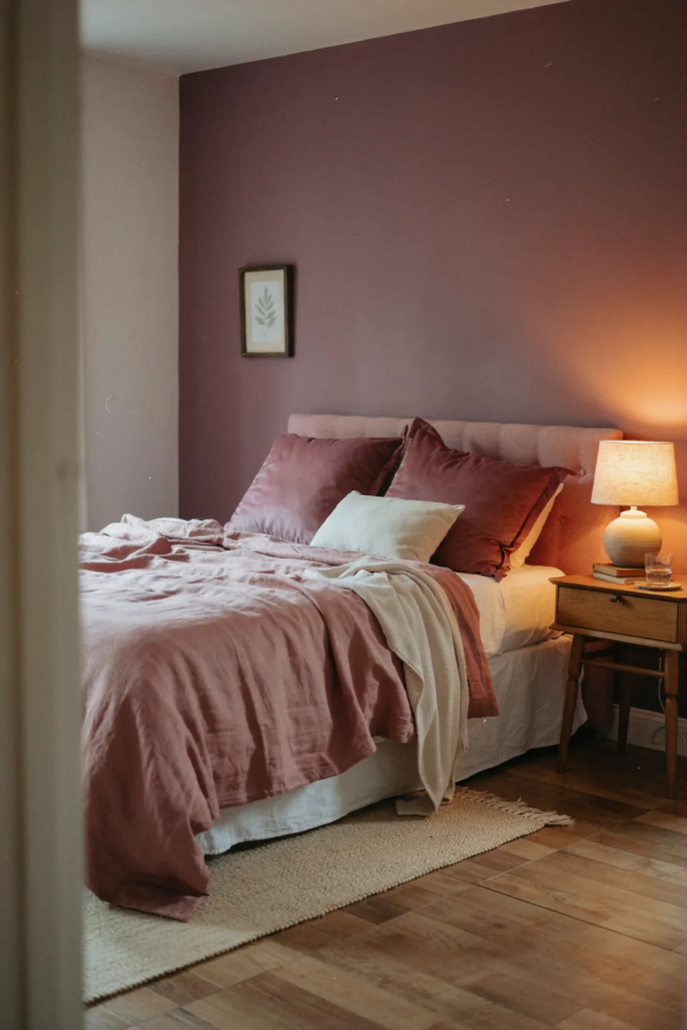
Plum and dusty rose share a family, so the pairing feels layered rather than contrasted — like a rose garden at dusk. Plum on an accent wall or in velvet cushions, dusty rose in bedding, cream to breathe between them.
Keep patterns minimal here; the colors are the decoration. Add candlelight and this becomes the most evening-beautiful pairing in the list.
17. Black & Natural Wood: Modern Contrast
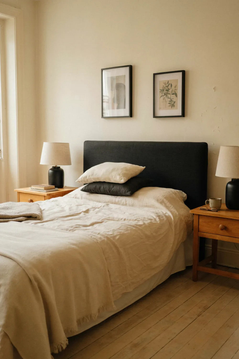
Black used sparingly — a headboard, lamp bases, picture frames — against warm natural wood and cream bedding creates the crisp, expensive contrast of a boutique hotel. The wood stops black feeling stark; the black stops wood feeling rustic.
Discipline is the price: black shows in a room, so every black object must earn its place. Three or four pieces, repeated, is the whole recipe.
18. Peach & Sage: The Soft Garden Pairing
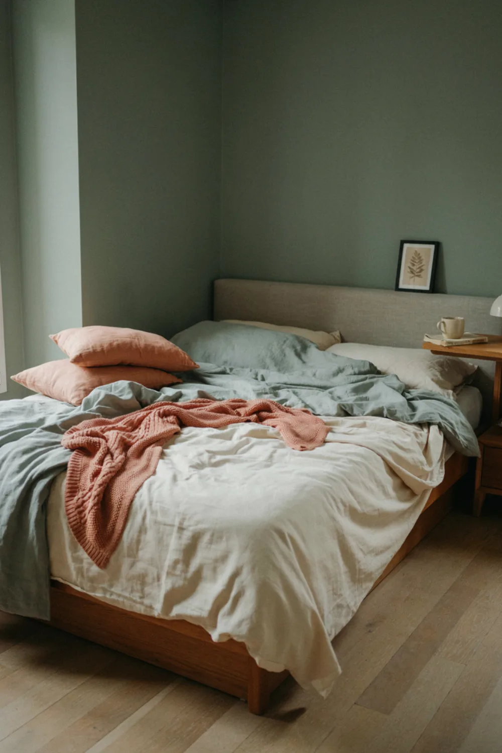
Peach and sage are garden colors that meet in the middle — warm and cool in perfect balance. Sage walls or bedding, peach cushions and a throw, cream between them, and the room feels like spring at any time of year.
Both colors must stay dusty. Bright peach and bright sage fight; muted versions hold hands. This is the gentlest pairing here for small, light-filled rooms.
19. Chocolate Brown & Cream: Cocoa Cozy
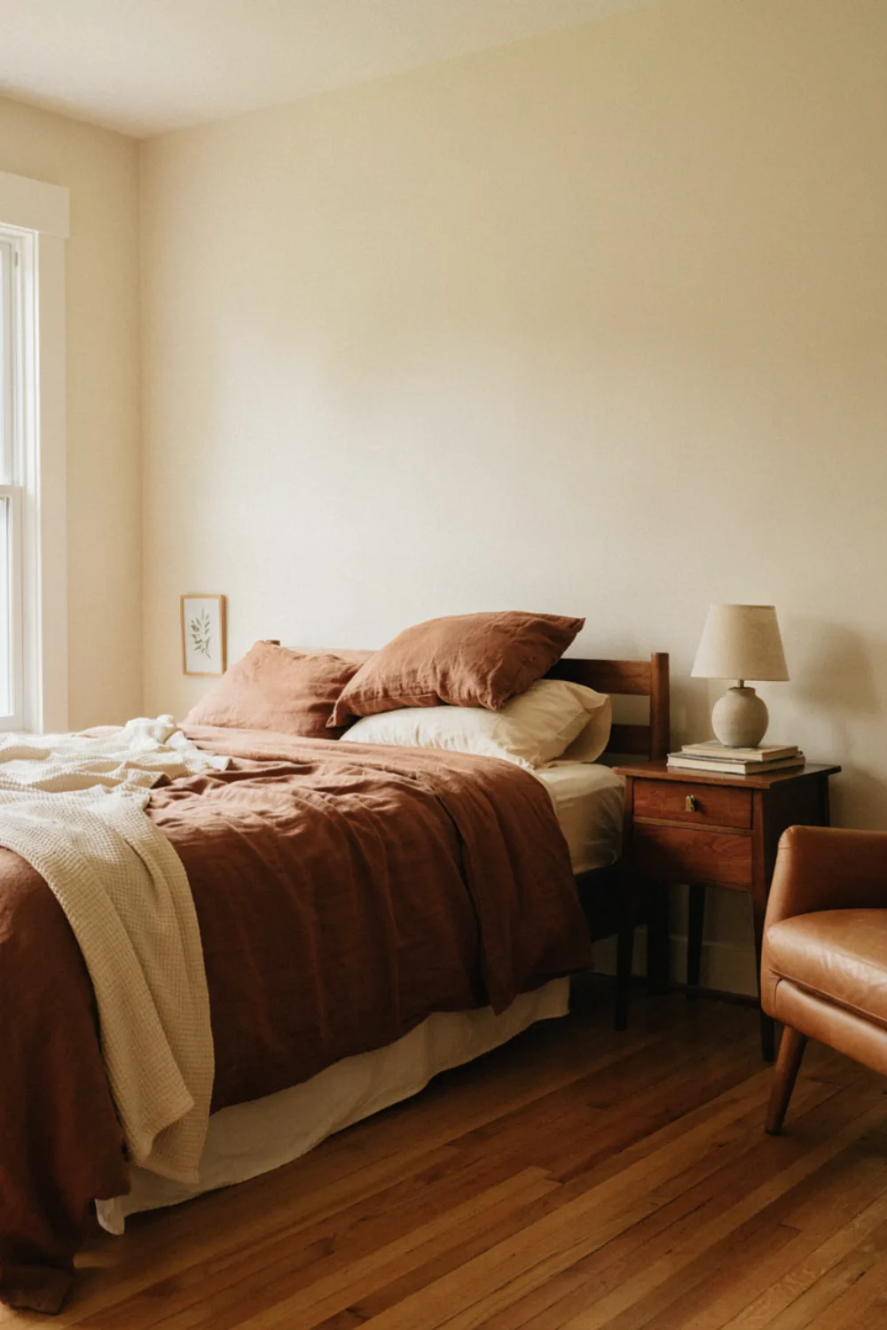
Chocolate brown is back, and with cream it makes the coziest pairing in this guide — brown bedding or an accent wall, cream layers above it, a little leather or dark wood to bridge the two.
Brown needs texture to avoid flatness: linen, knit, waffle, and boucle all play well. In lamplight this pairing reads as pure comfort, and it flatters every skin tone at the mirror.
20. Lavender & Pale Grey: Hushed and Dreamy
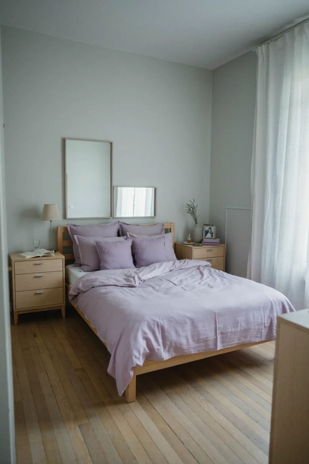
Lavender over pale grey is the quietest pairing here — grey walls, lavender bedding and cushions, silver or pale wood accents. It suits anyone whose bedroom must be a true wind-down space, and it photographs like a held breath.
Keep the lavender grey-leaning (a ‘dusty’ lavender) so the room stays serene rather than sweet. White bedding inside the pairing keeps it fresh through every season.
Three More Pairings Worth Knowing
The top ten will carry most bedrooms, but these three deserve an honorable mention — each one solves a specific problem beautifully.
Forest Green & Cream (With Walnut). The deeper, moodier sibling of sage and cream. Forest green bedding or a forest accent wall with cream textiles and walnut furniture creates a bedroom that feels like a cabin library — serious, warm, and extraordinarily restful at night. It asks for decent light or generous cream to balance it, so it suits south-facing rooms and confident decorators. In the evening, under lamplight, it may be the most handsome pairing in this entire guide.
Mustard & Warm Grey (With White). The cheerful modern pairing. Warm grey walls and bedding provide the calm; mustard arrives in cushions, a throw, or one chair like a patch of late-afternoon sun. It is the friendliest combination for people who find all-neutral rooms dull but all-color rooms exhausting. Keep the mustard golden and dusty rather than bright yellow, and let white sheets keep the bed fresh. This pairing photographs joyfully and suits creative, energetic sleepers who still want their room to settle them at night.
Deep Teal & Warm White (With Aged Brass). The jewel-box pairing. Teal — that blue-green depth — with warm white and brass makes a bedroom feel rich and slightly exotic, like a beautiful hotel in a coastal city. Use teal on the wall behind the bed or in velvet cushions, and let brass lamps and frames warm it. Teal is a strong color, so the 60-30-10 rule matters more than ever: white must hold the majority, teal the statement, brass the sparkle.
Matching a Combination to Your Room’s Light
The same pairing can be glorious in one room and gloomy in another, and the deciding factor is almost always the direction your windows face.
North-facing rooms receive cool, indirect light all day — no direct sun, a slightly grey cast. Colors cool down and darken here, so choose combinations with warmth built in: sage & cream, blush & gold, terracotta & sand, chocolate & cream. Cool pairings (dusty blue, lavender-grey) can turn chilly and flat in north light unless you warm them with wood, cream, and generous lamplight. In north rooms, also go one shade lighter than your instinct with the main color.
South-facing rooms are flooded with warm light that flatters nearly everything and intensifies warm colors. This is the home ground of the cool pairings — dusty blue, navy & white, lavender-grey all glow here — and the place where warm pairings should be chosen a touch more muted, because the sun will warm them further. South rooms are also where deep combinations (charcoal & blush, forest tones) can live without going gloomy.
East-facing rooms get bright, cool morning light and dimmer afternoons. Since bedrooms are mostly experienced in the morning and evening, east rooms reward pairings that look wonderful in fresh morning light — sage, dusty blue, warm white & wood — and rely on lamplight to carry the evening. Test your samples at 8am specifically.
West-facing rooms save their drama for the evening: flat light all day, then a blaze of golden sun at exactly wind-down time. Warm pairings become incandescent at sunset here (beautiful, briefly intense), and cool pairings get a lovely daily warm-up. If you mostly use the bedroom in the evening, test your swatches at sunset — that is the light your room will be judged by.
Whatever your direction, the rule is the same: swatches on two walls, judged at the hours you actually live in the room, before a single tin is opened.
The Two-Week Test: Living With a Combination Before You Commit
Paint and bedding are too expensive to choose from a one-inch swatch. Professionals test combinations at room scale, and you can borrow their method for the price of two sample pots.
Paint big boards, not wall patches. Buy foam boards or large card, paint each candidate color across the whole board, and move the boards around the room for several days — behind the bed, opposite the window, beside the wardrobe. Big samples show you the color’s behavior; little patches lie by omission.
Drape the bedding candidate. A duvet cover in the main color, borrowed from a store with a kind return policy or simulated with a large throw or flat sheet in the shade, tells you in one evening whether the pairing sings at bed scale. Live with it through a morning and a lamplit night before deciding.
Include the floor and the wood. Prop the boards against your actual furniture and hold them over your actual floor. Combinations fail at the junctions — the gorgeous sage that fights your orange-toned floorboards was never going to work, and the boards will tell you in week one instead of year one.
How to Use Any Combination: The 60-30-10 Rule
Whichever pairing you choose, divide it the stylist’s way. 60% goes to the base — walls and the largest textiles, usually the lighter color. 30% goes to the main color — bedding, curtains, a chair. 10% goes to the accent — the deep tone or metal: cushions, frames, a lamp, handles.
This ratio is why the rooms in magazines look balanced: no combination fails at 60-30-10, and almost every combination fails at 40-40-20. When a room feels “off” but you cannot name why, it is almost always the ratio, not the colors.
Also decide your pairing by your light. North-facing (cool light): lean warm — sage & cream, terracotta & sand, blush & gold. South-facing (warm light): you can carry the cooler pairs — dusty blue, navy, lavender-grey — beautifully. East and west rooms change through the day, so test at the hour you will mostly be in bed.
Going deeper: run the 60-30-10 audit on your real room. Take a daylight photo of your bedroom and list everything visible into three piles on paper: the dominant 60 (usually walls, bedding base, floor), the supporting 30 (curtains, rug, headboard, chair), and the accent 10 (cushions, art, lamp, plant). Most bedrooms that feel “off” are running something like 50-45-5 — the accent layer is too weak to give the eye a resting point. Fix order matters: adjust the 10 first because it is cheapest, then the 30, and only repaint when the first two cannot carry the combination. A second test: squint at your photo until it blurs. If the room reads as one flat tone, your layers lack contrast; if it reads as patches, one layer is fighting the others. Adjust until the blurred photo looks like gentle bands of light, middle, and dark.
How to Recreate a Pairing Step by Step
Step 1 — Choose by mood, then confirm by light. Pick the pairing that feels like the sleep you want, then sanity-check it against your window direction above.
Step 2 — Set the 60%. Paint walls or reset the largest textiles to the base color. This is usually warm white or cream — the cheapest, calmest foundation.
Step 3 — Add the 30%. Bedding or curtains in the main color, in matte, textured fabric. Stop here for a week if you like — two colors done well already look designed.
Step 4 — Place the 10%. The accent, in three small places (the rule of three makes it look deliberate): cushions, a lamp, frames.
Step 5 — Check at dusk. The pairing must pass the evening test — warm light on, room glowing, colors still friends. Adjust bulb warmth before adjusting colors.
Real-Life Problems, Solved
These are the questions real people ask most when a room isn’t working yet, answered for this style.
My bedroom feels dull. Should I add one bold color?
Spread it instead. One big red rug or a single bright wall can make a room feel bottom-heavy or patched. Repeat an accent in three places at a smaller scale, such as on the floor, at the window and on the bed, and it looks planned rather than added.
Neutral or colorful: which is right for a bedroom?
Both work. Many people love a quiet neutral bedroom and would hate to lose it. If you stay neutral, add interest through texture (linen, knit, wood, a rug with some pile) and one darker tone. If you want color, choose the muted version first and test it in your own light for a week.
Will a red or bright accent keep me awake?
Strong, saturated reds feel energizing, so keep them out of the view from your pillow. Muted rust, brick or berry tones give the same warmth without the buzz, and they pair well with the earthy combinations above.
Budget Guide: Where to Save, Where to Spend
Save on: the 10% — accent cushions, frames, and small decor are cheap in every color, and thrift stores are full of brass and wood. Paint for the 60% is also economical — one warm white covers most bases, literally.
Spend a little more on: the 30% — usually the bedding, the room’s biggest color statement and the thing you touch all night. Good fabric holds its exact shade through years of washing; cheap fabric fades, and a faded main color quietly unravels a whole pairing.
Mistakes to Avoid
Choosing colors from a screen or a tiny swatch. Colors shift hugely at room scale and in your light. Test big swatches on two walls and live with them for two days.
Forgetting the third element. Two colors alone can look flat. The small deep or metallic accent — the 10% — is what makes a pairing look finished. If your room feels unfinished, you are probably missing the 10%.
Matching the pair too exactly. Bedding, curtains, and rug in the identical shade of the main color looks like a kit. Vary the shade slightly from piece to piece — near-relatives, not twins.
Ignoring the floor and ceiling. A dark floor eats a pale pairing’s light; a bright ceiling saves a deep one. Include them in your mental 60-30-10.
Picking a palette you love in other people’s light. A pairing that glows in a sunny loft may sulk in your north-facing room. Your light is the co-author of every color — consult it first.
Your Color Combination Checklist
- Pairing chosen by mood AND by window direction
- 60-30-10 ratio planned before shopping
- Big swatches tested on two walls, two days
- Base color is a warm neutral (cream/warm white)
- Main color in matte, textured fabric
- The 10% accent placed in three spots
- Wood tone chosen to match the pairing’s temperature
- All bulbs warm (2700K) and checked at dusk
- Floor and ceiling counted in the scheme
- One deep anchor piece included
Frequently Asked Questions
What is the most relaxing bedroom color combination?
Dusty blue with soft white and sage green with cream consistently top both designer lists and reader polls for calm. Blue is associated with lower heart rates and sage with nature — both tell your nervous system it is safe to rest.
Can I mix two combinations I love?
Carefully, yes — if they share a base and a temperature. Sage & cream plus blush accents works (the blush becomes the 10%). Navy & white plus terracotta works less well because the temperatures and moods fight. When in doubt, let one pairing lead and borrow only the accent from the other.
What combination makes a small bedroom look bigger?
Warm white & natural wood, and dusty blue & soft white — light bases with gentle contrast reflect the most light. Keep the darker color low (bedding) and the lighter color high (walls, ceiling) for the most spacious feeling.
What if my partner and I like different combinations?
Choose by the base you share. Most people can agree on cream or warm white walls — then layer the contested colors as textiles, which are cheaper to compromise on and easy to adjust seasonally. A sage duvet in winter and dusty blue in summer is a legitimate peace treaty.
Do I need to repaint to change my combination?
Usually not. If your walls are a warm neutral, your combination lives in your bedding, cushions, curtains, and accents — all swappable in an afternoon. Paint matters most when you are choosing a strongly colored pairing like charcoal & blush or terracotta walls.
Final Thoughts
One last encouragement: almost nobody chooses the perfect pairing on the first attempt, and nobody needs to. Textiles can be returned, cushions can move rooms, and paint is famously repaintable. What matters is choosing a pairing deliberately, living with it properly for a season, and adjusting the ratio before you abandon the colors — most ‘wrong’ combinations are right combinations at the wrong ratio, and that is a ten-minute fix, not a failed room.
Save this for later
Save this list before your next bedding or paint purchase — choosing the pairing first, on purpose, is the difference between a room that accumulates and a room that composes. Start with the mood, check it against your light, and build 60-30-10.
Keep reading: 21 Sage Green Bedroom Ideas for a Calm, Earthy Retreat for a deep dive into pairing #2, and 23 Sky Blue Bedding Ideas for a Fresh, Airy Bedroom for everything about pairing #5’s beautiful blue.

One Comment